
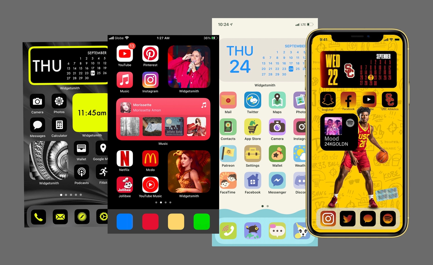
With the release of iOS 14 Apple has forever altered the way people experience the home screens on their phone. For the first time Apple now allows users to add widgets to their home screen, which when mixed with wallpaper customization and a shortcut hack to change individual app icons, means users can now bring their own personality to the home screen of their iPhone.
The Verge did an article on the phenomenon saying:
Search “#ios14” or “#ios14homescreen” on Twitter, for example, and you’ll see hundreds of examples of themed layouts that combine custom app icons, wallpaper, and widgets. All over TikTok and YouTube, too, people are showing off custom home screens and layouts."
We love this trend and think it is here to stay. Grandstand has always approached its app platform with a similar philosophy — give users the tools to create a design that matches their personal or corporate brand. Even though we have starter templates, once you get started on Grandstand you will quickly notice that any design you want to create can be accomplished.
The linchpin to this method is that Grandstand uses a similar architecture to Apple's home screen widget setups. For example, if you were to choose Grandstand's graphical layout style, you can create a grid that is 1, 2, or 3 graphics wide. What you load in those graphics is up to you. We give you the power to fully upload your own graphics (obscuring any text) or upload a background image that will sit behind stylized text for each menu item or button. The opportunities for customization are nearly endless.
Beyond the home page in Grandstand apps you have similar customization options. In fact there are more than 500 unique font areas you could customize in the platform if you wanted to. This means you control the font family, the font size, and the font color. And with more than 50 fonts to choose from you can definitely get creative.
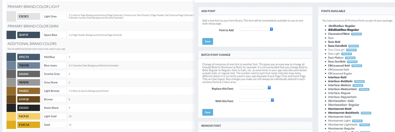
We also take color control seriously but require that you only choose up to 12 different colors to use throughout your app. Most of our apps stick to using 2-5 of those colors, but some choose to use the whole spectrum of colors.

We love seeing this customization trend on iOS take off and are proud that we have built a platform that uniquely aligns with the direction users are wanting. Your brand has a personality and it should not be hidden behind a bland app that shows your company logo tiny at the to top of the home page and then assumes you want to use their pre-selected styles and colors. Grandstand allows you to put your brand's personality first and focus on the experience you want to give to users. We've taken it even further with the release of Grandstand Sites, a website platform that runs off the same content as your app. Many app and web companies deliver the same pages in the mobile app that they do on the desktop web, not factoring in the differences with how users use each device. Desktop websites have lots of real estate to use and can present more content at any given time, with smaller touch targets, and more availability for direct linking to deep content. Whereas mobile apps have limited real estate, larger touch targets, but also have cameras, better geo-location information, and much more than can ever be brought to an app. With Grandstand Apps and Grandstand Sites, there finally exists a unified way to take one set of content, deliver it in your own personality and brand, in the format that makes the most sense to the user.
Just as many young adults are sharing what they create in iOS14 with the hashtag #ios14homescreen we have created a page that shows many of the designs and pages our clients have created with Grandstand in our Design Gallery. We can't wait to see what you create next!
New